I really enjoy redoing kitchens for people even though it can be challenging at times. The challenge is getting the kitchen completed as soon as possible and at the same time having everything in order at home and being the happiest mom in the world doing my duty as a homemaker. Since redoing a kitchen means having everything in a disarray until it’s completed, I like to be as prompt as possible.
The rewarding thing about it all is just seeing what a difference paint can make and seeing the happiness a kitchen makeover can bring! I had told myself that I would stick with only furniture makeovers this winter but a few weeks ago I was asked to redo a kitchen and I felt that familiar feeling of excitement and, of course, I couldn’t say no. I was especially excited when the owner chose to go with paint and glaze style. I had never done that before and had recently, just for fun, experimented on one of my laundry room cupboard doors. It turned out pretty good and thus became my sample door to show to my customers.
Here is a before picture of the kitchen…(I think it is cherry or birch)
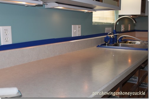
Everything will get a new look here, including the countertop…
The first step was to remove all the doors and drawers. I also took the recipe holder off that you can see hanging beneath the cabinets. I packed everything up to take home where I would work on it later. I then used my electric sander and sanded the cabinet frames with a medium sandpaper.
After wiping them down with a t-shirt rag, I gave them a coat of paint, using a bristle brush. Later after it was dry, I gave them a second coat.
Now, the countertop… I was a tad nervous about this since I never tried it before. I got a Giani Granite kit at Keim Lumber in Charm. Bombay black is the color that was chosen.
This is a six step kit for refinishing any surface countertops and I absolutely love it! I would recommend it to anyone. It costs around $74.00 with tax and has very user friendly instructions included. I did add my own rules here and there, but mostly I went by the step by step instructions.
First I masked off behind the backsplash and around the sink, basically any areas that I thought might be in danger of getting hit with paint.
Now the primer…
I waited a day to proceed with the next step, but since we’re on the subject, I’ll go on.
The sponging part is next. Included in the kit was a sample piece of black paper to practice on. After experimenting, I saw right away that the sponge included in the kit did not work for me. Instead, I used a scrunched up plastic bag to dab the paint on. It made a finer design that I liked better. I don’t have pictures of these steps. ( probably because I was too intent on what I was doing to think about taking pics)
There were three different colors to use (pearl, black and bronze) but I omitted the bronze. I felt with the color of the cabinets and hardware it would look better without.
Here is a close up of the result…
It was important to have no set pattern when applying this. I did all the pearl (silver) first and waited until it was dry before applying the black. (the instructions said it doesn’t have to be dry before applying the next color but I felt more comfortable giving it drying time.)
The final two steps were applying two clear topcoats.
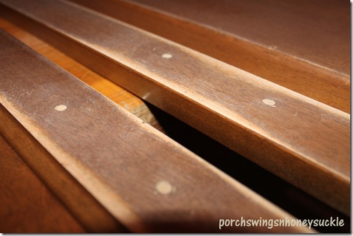
Back to the cabinets… When I had them at home and all laid out on tables and benches, I sanded them and wiped them clean. Since the doors got knobs with one screw instead of handles, the holes needed to be puttied.
This is the putty I used…
An old credit card works great to even out the putty. After it was dry, I sanded it.
Now the doors and drawers are ready for paint. I used my sprayer to paint them, giving them two coats of this white paint…
After two coats of paint, they are ready for glaze. This is a little tricky but fun. I soon discovered some ways of making it easier and felt the last doors turned out better than the first. One tip that worked for me was to not do the whole door at once and just work in sections. First I did the inside frame, only half of it at a time. Then taking a wet t-shirt rag, I wiped most of it off, making sure to keep any grooves filled with glaze.
I have gotten a lot of
questions on the glaze I used for this kitchen. I used a glaze by Zinsser that
is unfortunately discontinued. The color of the glaze was “Olympia’s Curls”
which seems to have disappeared from the formula choices.
I have since used a glaze by
True Value. It’s the kind that you mix with paint to color it. You can read
about a more recent paint and glaze kitchen I did here. I
have more detailed updates on that post.
Any excess glaze I made sure to blend in and not get too many streaks throughout the doors. I’m sure there are numerous and better ways to do the glazing but this being my first time I just felt my way through. I used enough glaze that the cabinets turned out off white.With wiping a lot of the glaze off you could get a white kitchen with only the grooves glazed I think. The following picture shows the different steps I took, allowing drying time in between steps. Once all that was completed I brushed some glaze onto the center of the panel and the frame and blended that in.
A few tips:
*Rinse out rag every two doors
*Work with small sections at a time
*When blending, watch so the end of your rag doesn’t drag elsewhere on the door (it will leave streaks)
*The more raises on your cabinets, the better… it takes a lot of time to apply glaze on areas where there are no grooves.
*If you mess something up, don’t stress…you can always sand, repaint & start over.
After the glaze was dry, I used polycrylic for the final coat…
Again, I used my trusty sprayer to apply. This can be rolled or brushed but it’s pretty fast drying so you really have to work fast and not do any rebrushing or rolling if it at all has started to dry.
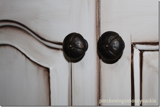
Finally, after applying some glaze and polycrylic to the frame it was ready to hang the doors and fasten the hardware. ( I love the pulls and knobs that were chosen for this kitchen..as you will soon see!)
Again, here is the before…
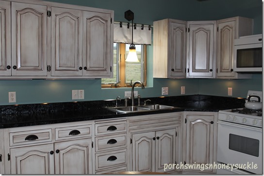
Now the after…
This was one of my most fun kitchens ever… I had nice people to work with and it gave me the chance to explore something new, which I love! If any of you want to attempt this with your own kitchen, don’t hesitate…it’s really not that hard. Feel free to ask any questions you may have...I’ll do my best to answer!
I have to add the trash can that I also painted for this kitchen. For some reason I didn’t get a before picture but to give you an idea…it was one of those older styles – oak with colorful fruit painted on the lid. I used basically the same method as the cabinets and added the text using carbon paper to transfer…
Happy Friday, everyone!
)
